Have you ever wondered why so many restaurant logos use red, or why luxury boutiques lean toward minimalist, black-and-white designs?
It’s not a coincidence – it’s psychology.
Every visual element in your brand – from the colour of your logo to the layout of your shop – is having a silent conversation with your customer’s brain. It shapes how they feel about your business long before they even interact with you.
This is design psychology, and understanding a few of its key principles can help you build trust, influence buying decisions, and create a lasting impression – no massive budget required.
Whether you’re running a boutique in Coimbatore or a wellness store in Pollachi, these insights will help your visuals work for you, not just with you.
1. Colour Speaks Louder Than Words
Colour is one of the most powerful tools in marketing because it triggers emotion before logic. Before a customer reads a single word, the colour palette of your brand has already communicated something to their subconscious.
Here’s what different colours say:
- Red & Orange → Energy, urgency, and appetite. These colours prompt people to act quickly and are ideal for “Order Now” buttons or restaurant menus.
- Blue → Trust, calm, and professionalism. Ideal for financial services, tech brands, or consultants where reliability matters.
- Green → Nature, wellness, and balance. Perfect for organic shops, eco-friendly products, and wellness centres.
- Black & Gold → Luxury, exclusivity, and sophistication. Use them to create a premium look for boutiques or designer brands.
Pro tip: Pick one or two dominant colours that align with your brand personality and use them consistently across all your materials – from your storefront to your social media.
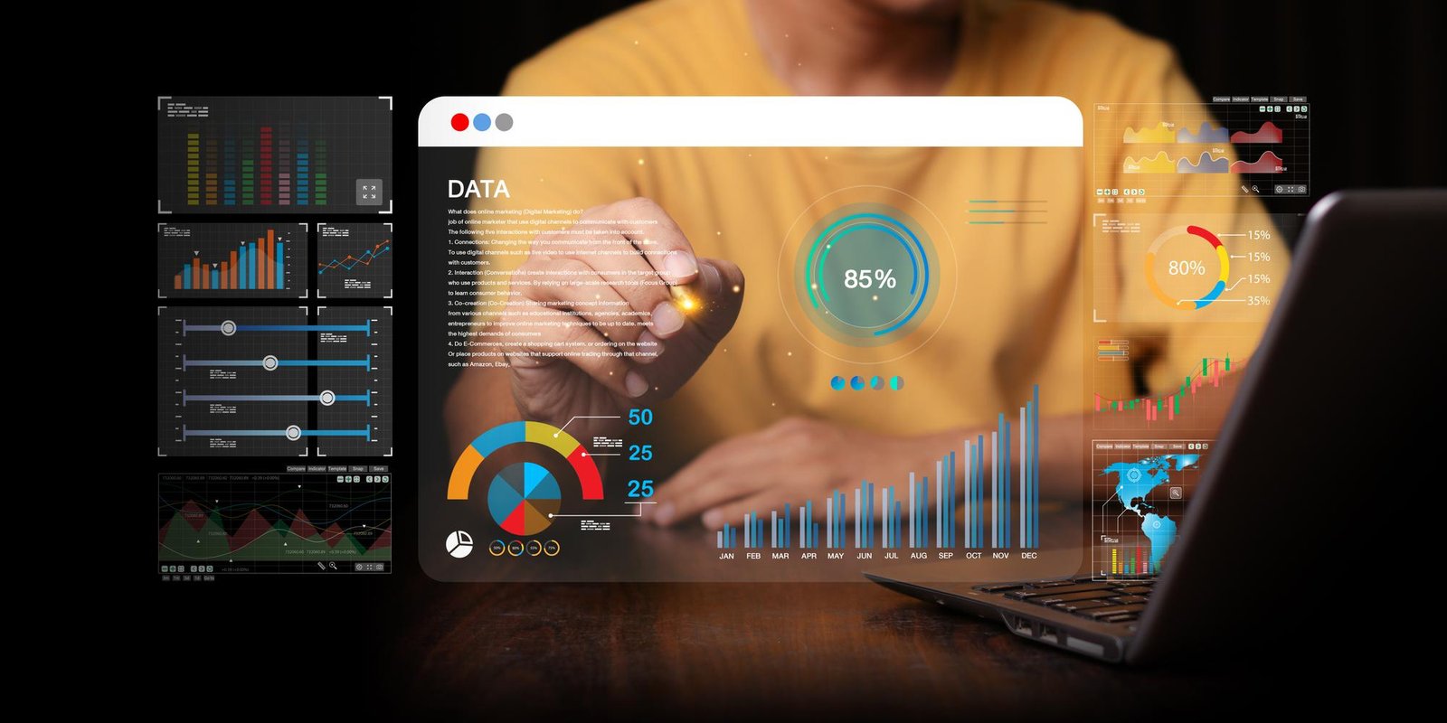
2. The Brain Trusts Simplicity
Our brains naturally prefer things that are easy to process. A clean, simple design feels trustworthy, while clutter can trigger anxiety. This is called cognitive fluency – the easier something is to understand, the more people trust it.
Online:
- Use ample white space. Let your visuals breathe.
- Stick to easy-to-read fonts and limit yourself to two or three typefaces.
- Create a clear navigation flow – visitors should instantly know where to click next.
Offline:
- Keep your shop layout open and inviting.
- Display prices clearly.
- Remove unnecessary clutter from counters or display tables.
Simplicity doesn’t mean boring – it means effortless to experience.
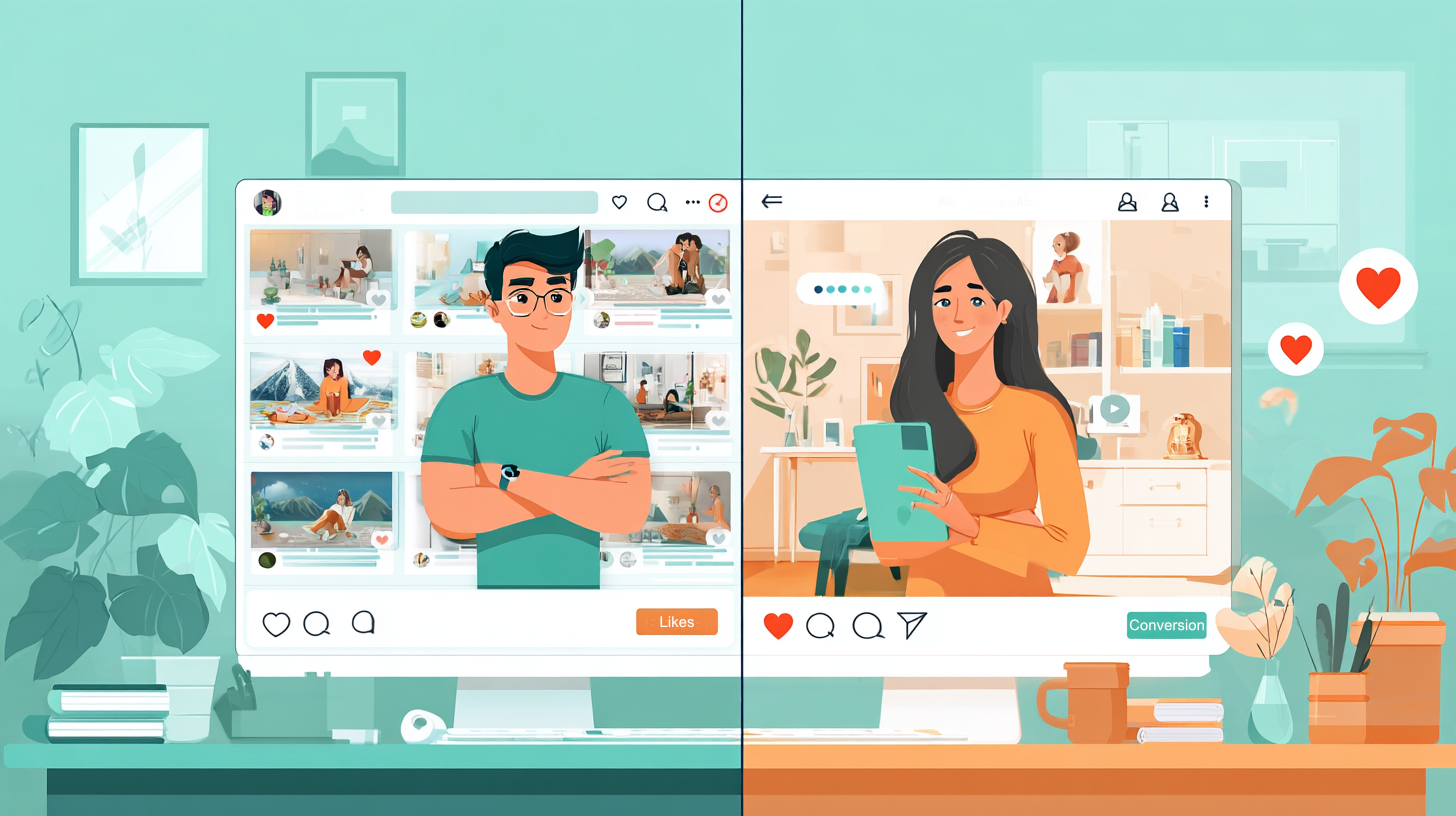
3. We Are Wired to Follow the Crowd
The human brain is social by nature. When we see other people enjoying something, our instinct tells us to trust it. This is the principle of social proof – and it’s a visual marketing superpower.
The most persuasive image on your website isn’t a product photo – it’s a real customer using your product with a genuine smile.
- Feature local customers (with permission) on your website or social media.
- Showcase testimonials with names and faces.
- Replace stock photos with real-life stories from your community.
When potential buyers see someone like them enjoying your brand, trust follows naturally.
The Bottom Line
Design psychology isn’t about decoration – it’s about communication. Every colour, font, and layout choice sends a message.
Take a fresh look at your website or store today and ask yourself:
“What silent message am I sending?”
Because when your visuals connect emotionally, your customers won’t just see your brand — they’ll feel it.
#DesignPsychology #VisualBranding #BuyerBehaviour #SmartDesign #BrandWithUs #BrandStrategy #DesignThinking #MarketingDesign #EmotionalBranding #ConsumerPsychology #SmallBusinessMarketing #LocalBranding #CoimbatoreBusiness #TamilNaduDesign #CreativeEntrepreneurs #ColorPsychology #MinimalistDesign #DesignMatters #BrandPerception #CreativeStrategy